The Little Details
These two inline remotes are pretty similar in form and function. They both feature two volume control buttons and a multi-use button in the center. They should both work equally well. Right?
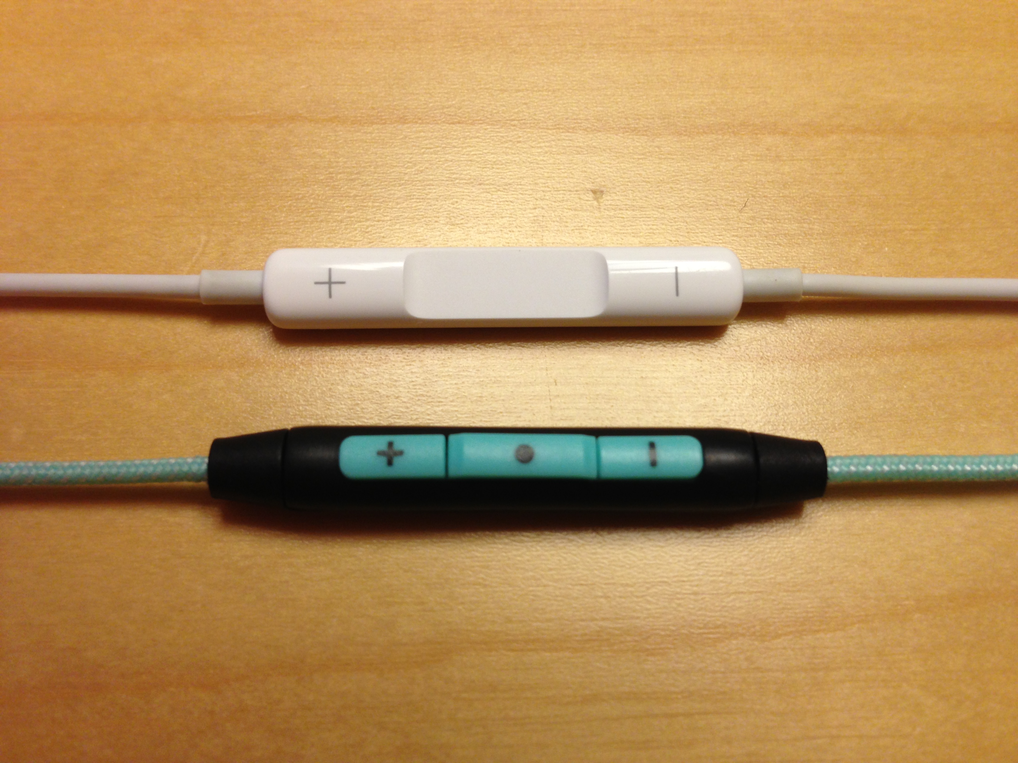
That’s what I thought when I purchased the earbuds on the bottom, the Philips O’Neill The Covert. They have good reviews. The construction seemed durable. They also looked comfortable. It wasn’t until I tried using the inline remote that I realized that I had been taking something for granted all along.
Below, you can see the difference in the profiles of of Philips earbuds at the bottom and the Apple EarPods on top. In Apple’s case, the volume buttons are at an equal level, but the center button is indented. In Philip’s case, the center button is slightly raised from the volume buttons which are also raised from the remote housing. When I first used the inline remote in the Philips earbuds, I couldn’t find the center button with my finger. I had too look down at it to see where my finger was.

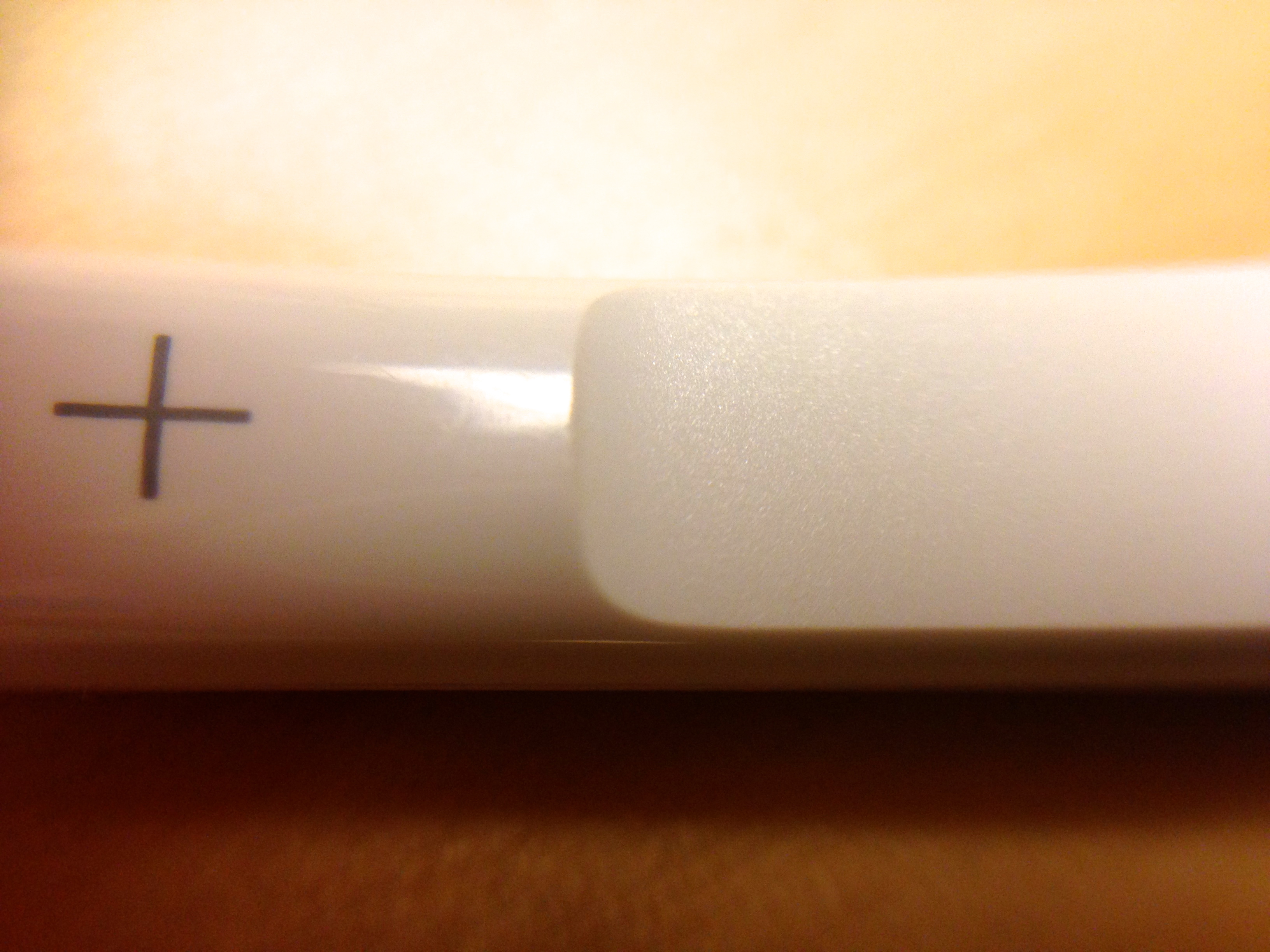
This is an inline remote. If I have to look down at it to use it, it has failed one of its primary requirements. Someone at Apple thought about this aspect of usability. The inline remote in the EarPods feels like a continuous, smooth surface with a cutout in the middle. The texture of the center button is rough and the edges around it are sharp. It couldn’t be clearer which button is which.
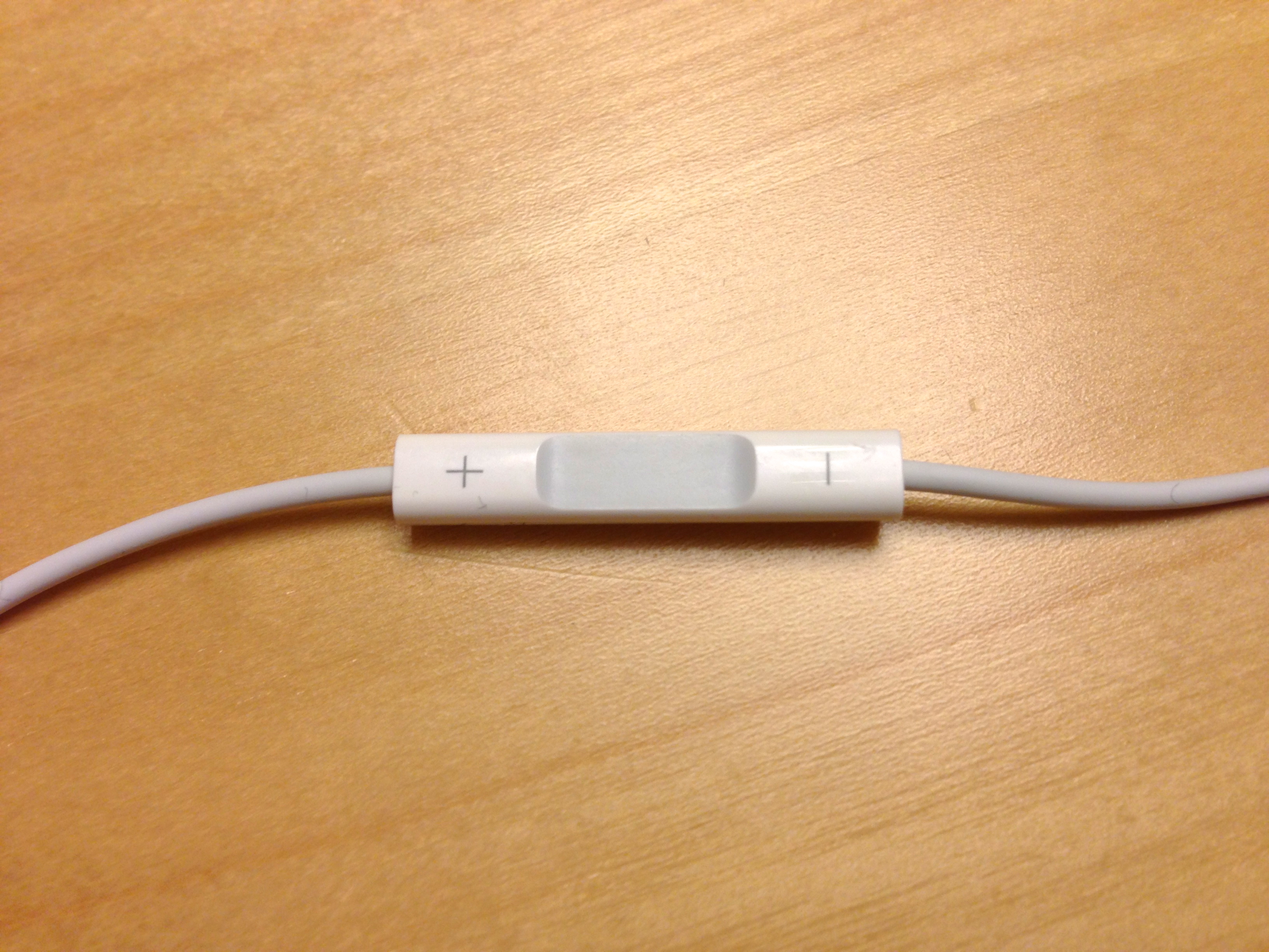
This design isn’t new either. Apple has been doing this for years, as you can see on my 3 year old earbuds below.
This is good design. Apple didn’t have to make the inline remote usable. They could have arbitrarily designed it and called it a day, as Philips seems to have done. It reminds me that very few companies actually care about the little details that contribute to user experience.